24 December 2009

The Home Poster Project

I was lucky enough to be one of about 20 people to take part in and represent London College of Communication in the Home International Poster Project. This project promotes dialogue through design by linking design students from schools all over the world to address the universal theme of 'home'. The project comprised of a week long workshop with Graphic Designer Yasha Rozov and Lucy Brown on a travelling exhibition.

My design comes from the idea that home is made up of your possessions; after leaving home 2 years ago, my room in my parents house didn't feel like home anymore, because there
was nothing familiar in it, nothing that physically connected it with me, it was just an empty shell.
As soon as I put my belongings into my new room in London I felt at home, and the same feeling came again this year when I moved into a new house.

10 December 2009

The Making of Call Signs

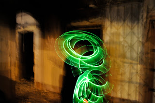
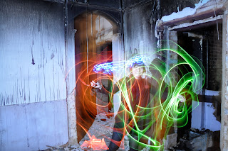
Stills from my music video as I'm having trouble uploading the actual video.


Call Signs

We have just completed our most intense uni project yet; 2 weeks to make a music video (on top of two 1800 word essays and a book cover project).

I had the pleasure of working with Karen Ma, Cong Sang, Olly Gibbs, Julian Camilo & Thomas Hayman. We chose to make our video for the band Breton, a London based band, and their song 'Call Signs'.

We didn't brainstorm a story, we just knew from the vibe of the song that we wanted to be play with light in the pitch black. We found the perfect location in Elephant & Castle...


It was touch and go filming in this burnt out house, firstly the six of us had to climb through a barbed wire fence, which was a bit challenging on a main road with police constantly going by. And secondly, once we were in, we realised junkies were living there; there was needles, fresh food and bedding all in the basement. No one was there when we got in but we didn't know when they would be 'home'.

Here's our music video, hope you like it!


4 December 2009

Freakonomics 2

This is the second set of designs for my Book Cover Project, I think I might have two outcomes as I think this idea is just as strong as the light graffiti concept.

These designs have a completely different concept, picking up on how Freakonomics examines why people do the things they do... so it has a gun to symbolise how it looks at the trigger for peoples actions, and it the gun is dismantled to symbolise how the book examines these trigger.

I wanted to incorporate the financial times into the design to highlight how the book examines economics.

I screen printed the gun design onto the newspaper first, but I didn't think it worked well as a design, so I then made a screen of a newspaper column and printed it as the background to my design. Also part of the symbolism of my design was to show how Freakomics was a reflection of one person's view of our world. So I decided to print my design onto mirror card.

This was my first time screen printing and i loved it! A big thank you has to go to the Chelsea textile design girls for letting me move into their studio for the last couple days to produce this!